I designed and illustrated these separate posters for two talented musicians, and since I ended up doing similar things for each of them, it's now a theme!
As I understand it, recitals are an essential step for people pursuing degrees in music, and require much presentation and care on top of a whole lot of hard work, planning, and practice. But they're also very fun events to share with peers, professors, family, and friends. As such, an artful poster does a lot to bring a visual element to the promotion of the musician's academics and career, and is an opportunity to expand on their theme and invite the audience to celebrate their hard work. As a visual artist, I always love collaborating with musicians to bridge the two disciplines and add to the richness of the art world.
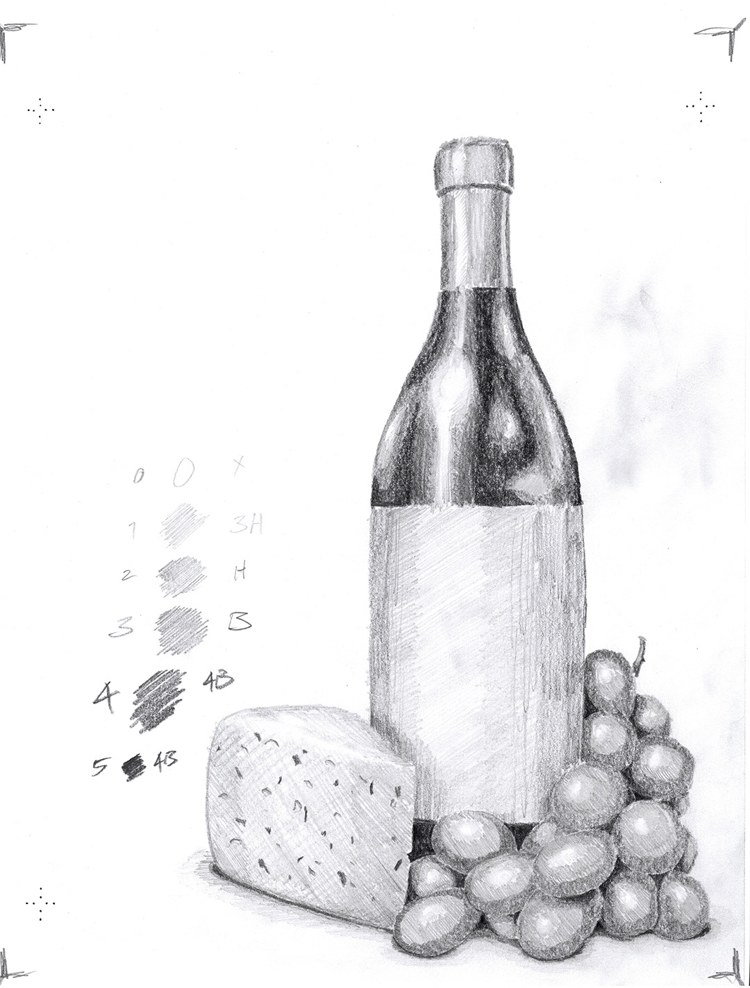
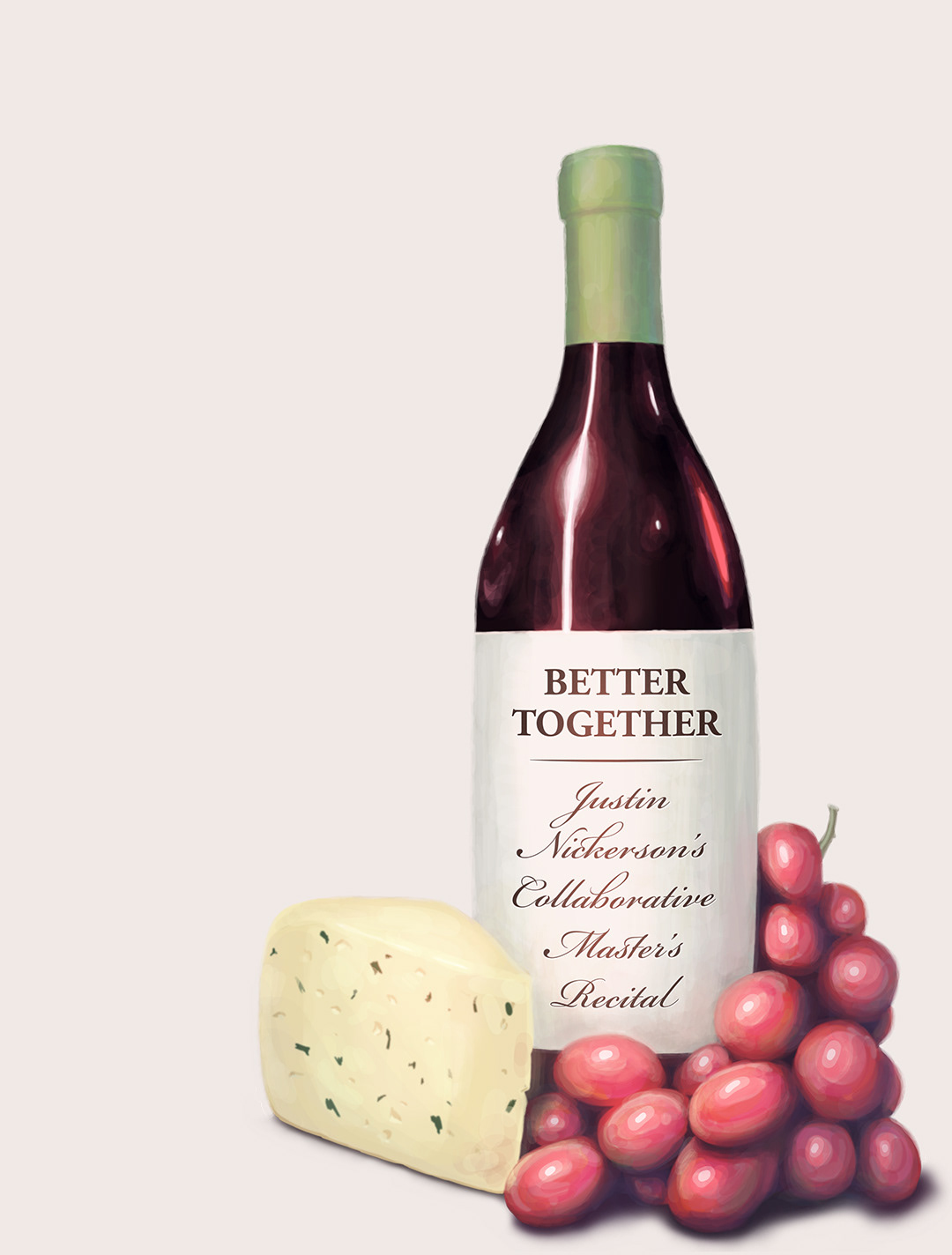
Justin kept the project brief open— just asking for something to build on the theme of "Better Together", which he incorporated throughout his recital, in the themes of the music and in the decision to involve so many collaborators. I came back to him with a concept for a digitally illustrated poster featuring these snacks that certainly are better together, and we went forward with that.
I painted the props and set the typography in an aesthetic approach that I felt reflected his style as an artist, being familiar with the kinds of pieces he selected in prior performances. Garamond is a classic typeface reaching back to one of the earliest true type designers in the western tradition, and the EB Garamond production of it is a great modern take featuring a nice variety of glyphs and flourishes, only one of which I redrew according to my own preference. As an old style serif, it holds on to a quaint formality, but is also technically powerful and legible.
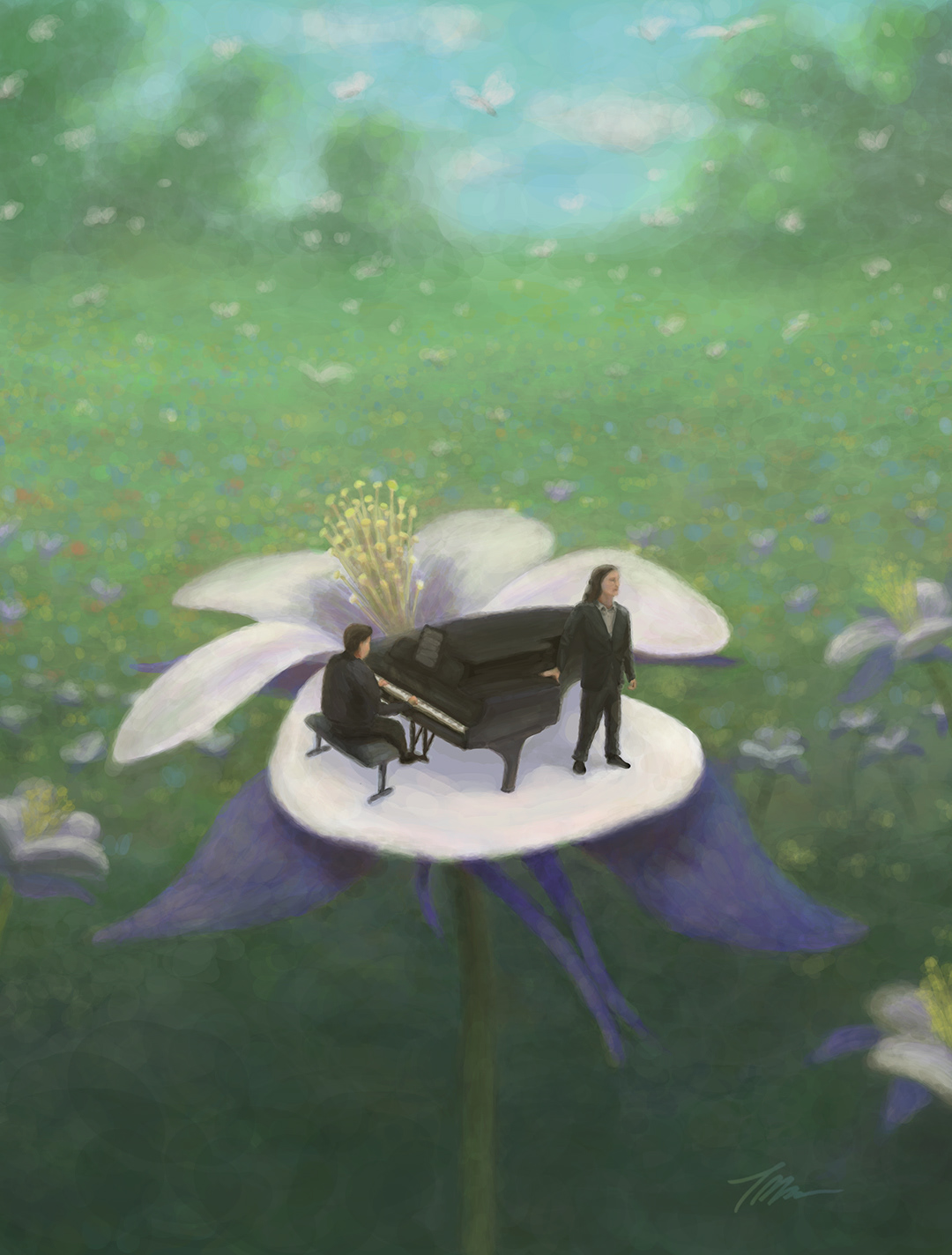
I used a painting technique I've been developing for a while; the same approach I used with the poster below. I'm trying to apply some principles of impressionism in a digital format to capture a soft texture and realism of color, but in a reasonable amount of time and with limited resources.
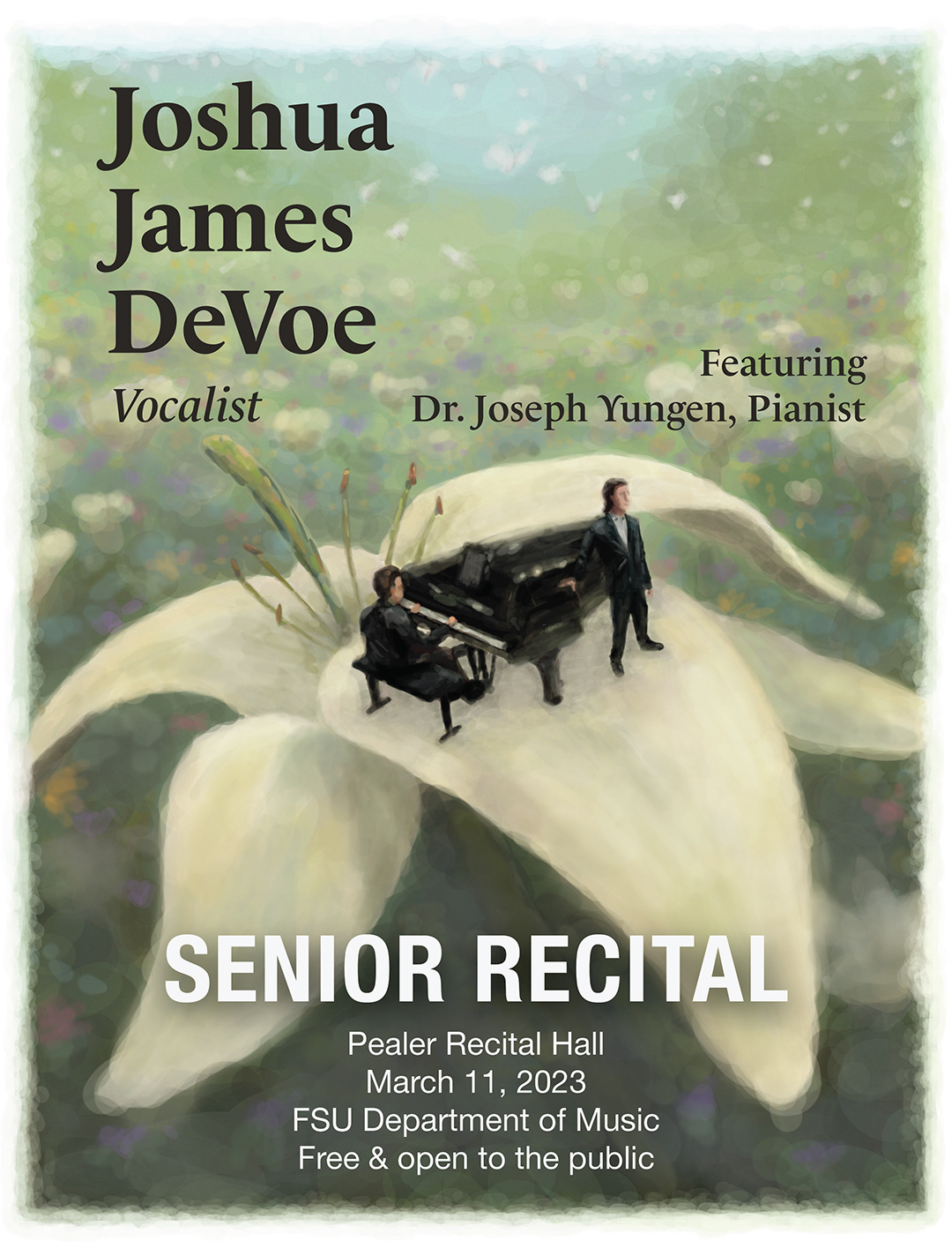
JJ came to me with a concept that was a lot of fun to bring to life— himself and his collaborator standing surreally on the petal of a flower. Originally, it was a lily, but after some consideration and work, he decided to feature a columbine, calling out the state flower of his home state; Colorado. I used a bold type treatment with two typefaces on top of this and aimed to design the poster with energy and life, working on a soft edged digital painting technique that allowed the background to sit comfortably behind the type.

